
As a front-end developer or designer, you play a critical role in creating visually appealing and engaging websites that provide superior user experience. To achieve this, it’s important to stay up-to-date with the latest website design trends and user expectations.
In the rapidly evolving world of website design, staying ahead of the curve is crucial to staying relevant and meeting the evolving needs of your users.
In this article, we’ll take a look at seven of the most important website design trends for 2023.
Stay ahead of the curve, stay inspired, and learn how to create visually appealing and engaging websites that provide a superior user experience.

Design Trend 1: Minimalism
Minimalism has been a popular trend in website design for a few years now. And it shows no signs of slowing down. The idea behind minimalist design is to simplify and declutter the visual elements on a website. Thus, creating a clean and uncluttered user experience.
A minimalist design typically focuses on a limited color palette, minimal use of graphics and imagery, and simple typography. Here are a few key elements of minimalist design:
- Limited color palette: A minimalist design will typically only use 2 or 3 colors. This creates a clean and calming visual experience.
- Simple typography: Minimalist designs will typically use simple and easy to read font styles, rather than more elaborate and decorative font styles.
- Minimal use of graphics and imagery: Minimalist designs will typically limit the use of graphics and imagery. They will be simple and understated when used.
An example of a minimalistic website design is the website for Apple Inc.
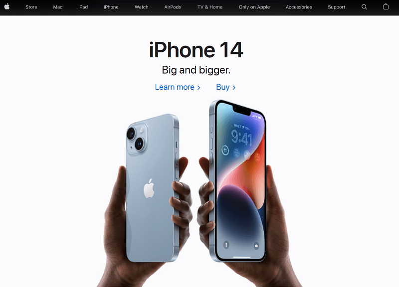
The simple and clean design, paired with a limited color palette and simple typography, creates a user experience that is both modern and easy to navigate.
Design Trend 2: Dark mode
Dark mode has become increasingly popular in website design. It’s not hard to see why. Dark mode is a website design trend where the background color of a website is changed to a dark shade. It creates a more immersive and visually interesting user experience.
Dark mode is not just stylish, it also offers several benefits to users. Like reducing eye strain and saving battery life on devices with OLED screens. Here are a few key elements of dark mode design:
- Dark background color: A dark mode design will typically use a dark shade for the background color, such as deep gray or black.
- High contrast: To ensure readability, dark mode designs will typically use high contrast colors for text and other elements. Usually, white or light shades of gray work.
- Attention to detail: Since dark mode designs rely on high contrast for readability, it’s important to pay close attention to details. The placement of text, the use of shadows, and the spacing between elements.
An example of a dark mode website design is the social media platform, Twitter.
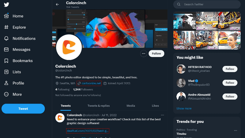
Twitter’s dark mode design creates a visually interesting and immersive user experience. Also, it offers the benefits of reducing eye strain and saving battery life.
Major social media platforms, such as Facebook, Twitter, LinkedIn, and Instagram allow marketers to turn dark mode on. Many digital marketers are experimenting with dark mode to create social media ads and posts. This is to highlight the unique tone and brand presence. You can also create social media posts in dark mode to earn the attention of users and stand out on social feeds.
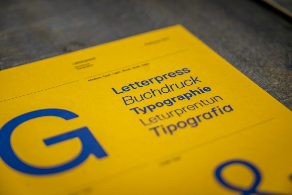
Design Trend 3: Bold Typography
Bold typography is a design trend that is becoming increasingly popular in website design. The idea behind bold typography is to make text the focus of a website. Thus, creating a bold and eye-catching visual experience. Bold typography can be achieved through the use of large font sizes, creative font styles, and a focus on typography as a key design element. Here are a few key elements of bold typography design:
- Large font sizes: Bold typography often uses large font sizes, which creates a strong and impactful visual experience.
- Creative font styles: Bold typography can be achieved through the use of creative font styles, such as script, hand-drawn, or decorative font styles.
- Typography as a key design element: In bold typography designs, typography is often given equal importance to other design elements, such as color and imagery.
An example of a website with bold typography is the website for the photo editing tool, Colorcinch – the same website you are reading this on.
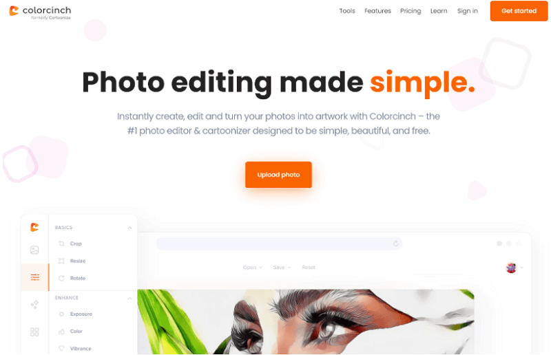
The website uses large and creative font styles, making text the focus of the design and creating a bold and impactful visual experience.
Design Trend 4: AI Art
Using AI art as a design trend is a relatively new, but rapidly growing trend in website design. AI art refers to the use of artificial intelligence algorithms to generate unique and interesting imagery for use in website design. By using an AI image generator, you can create visually compelling art and stand out from the crowd.
AI art can also be used to illustrate blog articles, social media posts and ads. That’s why the best AI writing tools have AI art generators built-in. Or at leads purchasable as add-ons.
AI art offers several benefits, including the ability to create unique designs that are not possible with traditional design techniques. Moreover, it gives you the ability to automate the design process, saving time and effort. Here are a few key elements of using AI art in website design:
- Uniqueness: AI art algorithms can create unique designs that are not possible with traditional design techniques. So, AI art is a great way to stand out in a crowded online landscape.
- Automation: AI art can automate the design process, saving time and effort. Hence, it allows designers to focus on other aspects of website design.
- Integration with other design elements: AI art can be integrated with other design elements, such as typography and color. This is to create a cohesive and visually interesting user experience.
An example of a website design that uses AI art is the website for the design agency, The Grid.
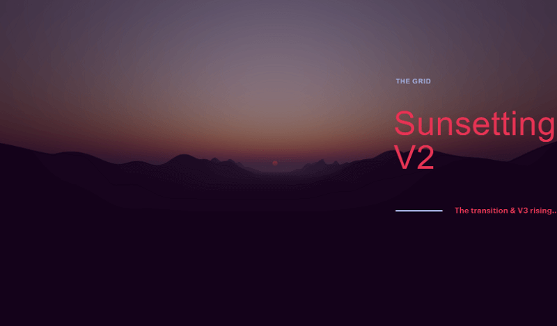
The Grid’s website uses AI algorithms to generate unique and interesting graphics and imagery. It creates a visually interesting and immersive user experience.
Design Trend 5: Responsive Design
Responsive design is a design trend that has become increasingly important in recent years. This is since more and more people access the web from a variety of devices, including smartphones, tablets, and desktops.
Responsive design refers to the practice of designing websites that automatically adjust to the size of the device being used. Thus, provides a seamless and user-friendly experience regardless of the device being used. Here are a few key elements of using responsive design:
- Flexible layout: Responsive design uses a flexible layout that adjusts to the size of the device being used. This provides an optimal viewing experience.
- Content prioritization: Responsive design often involves prioritizing content based on the size of the device being used. This ensures that important information is always easily accessible.
- Optimization for different devices: Responsive design takes into account the different screen sizes and capabilities of different devices, and optimizes the design accordingly.
An example of a website that uses responsive design is the website for the news and media company, CNN. The CNN website uses a flexible layout that adjusts to the size of the device being used. So, a seamless and user-friendly experience is provided regardless of the device being used.
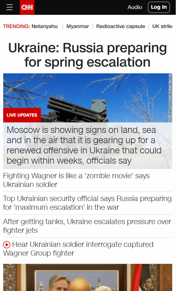
The website is optimized for different devices, with content prioritized based on the size of the device. With this, important news and information is easily accessible. The design is aesthetically pleasing and functional across all devices.
This makes it easy for users to stay informed and up-to-date with the latest news and developments from around the world. That is with any type of device they might be holding.
Design Trend 6: Interactive Elements
Using interactive elements as a design trend is a way to enhance the user experience and engage users with your website.
Interactive elements refer to any element on a website that allows users to interact with the content. They come in the form of buttons, forms, sliders, and more. Here are a few key elements of using interactive elements in website design:
- Enhancing the user experience: Interactive elements can enhance the user experience by making the content more engaging and interactive.
- Encouraging user interaction: Interactive elements can encourage users to interact with the content. Thus, increasing their engagement and improving the overall user experience.
- Providing useful and relevant information: Interactive elements are used to provide useful and relevant information to users. Examples are interactive maps, flowcharts, and graphs.
Tip: A webflow design agency can help you design and develop custom interactive elements that align with your brand and enhance the user experience on your website.
Another example of a website that uses interactive elements is the website for the travel company, Airbnb. The Airbnb website uses interactive elements such as image sliders, maps, and filtering options. This enhance the user experience and encourage user interaction.
The interactive elements provide useful and relevant information, such as property listings, location details, and traveler reviews. These would help users to find the right accommodation for their needs.
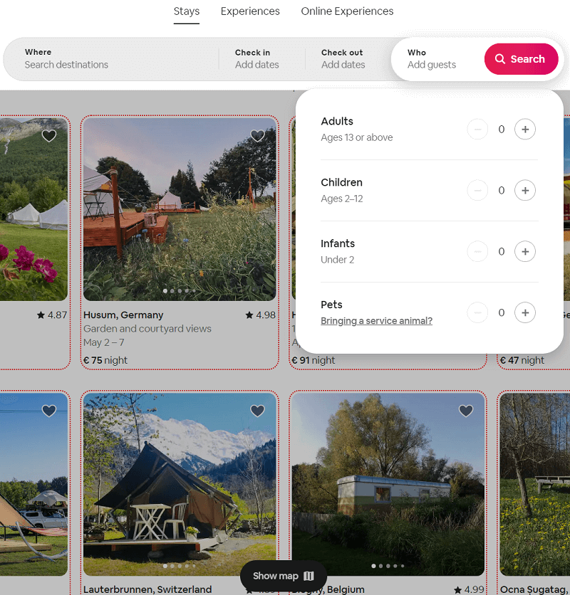
The website also uses interactive elements such as 360-degree virtual tours to give users a more immersive experience. Thus, help them make informed decisions about their travel plans.
The use of interactive elements on the Airbnb website makes it an engaging and effective platform for booking travel accommodations.
Design Trend 7: Micro-animations
Using micro-animations as a design trend is a way to add a touch of personality and dynamism to your website. Micro-animations are small, subtle animations that enhance the user experience by providing visual cues and feedback.
Here are a few key elements of using micro-animations in website design:
- Enhancing the user experience: Micro-animations can enhance the user experience by making the content more visually appealing and engaging.
- Providing visual cues and feedback: Micro-animations can provide visual cues and feedback. Such as indicating the status of a button or form field, or highlighting a particular feature or element.
- Adding a touch of personality: Micro-animations can add a touch of personality to your website. This makes your site more memorable and appealing to users.
An example of a website design that uses micro-animations is the website for the digital design agency, Dribbble. The Dribbble website uses micro-animations such as hover effects, scrolling animations, and loading indicators. Such enhance the user experience and provide visual cues and feedback.
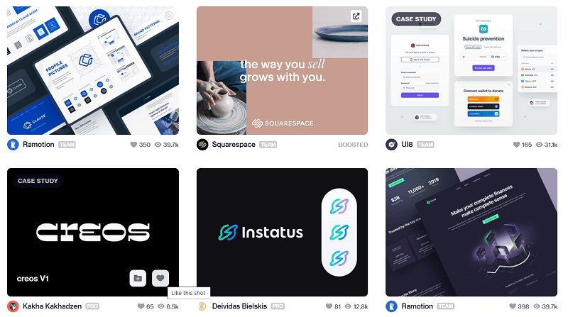
The micro-animations add a touch of personality to the website, making it more visually appealing and engaging.
The use of micro-animations on the Dribbble website makes it standout. It enhances the user experience and add a touch of personality to a website design.
Key Takeaways for Design Trends You Should Know About
In summary, the website design industry is constantly evolving. It’s important for web developers and designers to stay up-to-date with the latest trends. To some extent, design trends will go hand-in-hand with marketing trends.
Each trend brings its own unique touch to the website design and enhances the user experience in its own way. By incorporating these trends into your designs, you can create visually appealing and engaging websites. Hence, provide a superior user experience.
As a web developer or designer, it’s crucial to keep up with the latest website design trends and incorporate them into your work. Not only will this ensure that your websites are visually appealing and engaging. But it will also help you to stay ahead of the competition and remain relevant in an ever-changing industry.
Whether you’re a web developer or designer, it’s important to keep up with the latest trends and continue to innovate in your designs.
So, stay inspired, stay informed, and keep pushing the boundaries of what’s possible in website design.
About Guest Author: Erkki Muuga
Erkki is the founder of influno.com, which helps entrepreneurs, marketers and sales managers make the best decisions on the business tools to drive their businesses forward. Erkki’s background is in software product management.