

Your product photos play a significant role in capturing the attention of potential customers.
Not only that, but they also help customers determine whether they should buy your product. Studies show that 75% of online shoppers expect to browse product photos before purchasing.
And it turns out the quality of your photos makes an even bigger difference. High-quality product photos can lead to a 94% higher conversion rate than low-quality photos.
One thing that can impact the quality of your product images is color harmony. Your colors can evoke different emotions, affecting how customers perceive your brand.
Let’s look at how using color in product photography can elevate your e-commerce product pages and help your business stand out.
Why Does Color Harmony Matter in Product Photography?
Mastering color harmony through strategic photography helps drive sales and enhance customer satisfaction for e-commerce. Let’s take a wholesale frames business, for example.
Using techniques like complementary color schemes, natural lighting, and creative composition, photographers can highlight the beauty and versatility of their frames. Doing so can entice potential buyers and foster a sense of trust in the product’s quality.
Let’s look at another example of how selecting the right hues impacts the visual appeal of a product.
When capturing a wedding outfit for men, paying attention to color harmony is crucial.
StudioSuits, a clothing brand known for its high-quality men’s suits, is a perfect example of a brand that harmonizes colors flawlessly in its e-commerce photography.
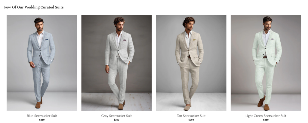
Image source: StudioSuits
By strategically using complementary hues and paying meticulous attention to backgrounds, StudioSuits makes sure that each ensemble shines vibrantly on the digital shelf.
The company’s expertise in proper color grading further enhances the overall aesthetic. As a result, it creates captivating visuals that draw in potential buyers.
Prioritizing color harmony in its photography allows StudioSuits to showcase its products and establishes a cohesive brand identity that resonates with its target audience.
9 Tips for Leveraging the Power of Color in Product Photography
Now, let’s examine how to increase the power of your product photography to drive sales.
1. Learn the Color Wheel
Remember the color wheel from art class? It remains relevant in product photography and helps you create cohesive color schemes in your product photos. By understanding the relationships between colors, you’ll see what works and what doesn’t.
Paying attention to the details helps you achieve the perfect color balance.
The basic color wheel includes red, yellow, and blue — the primary colors.
When you mix these colors, you get your secondary colors — orange, green, and purple.
And when you mix those colors, you get tertiary colors:
- Yellow-orange
- Yellow-green
- Red-orange
- Red-violet
- Blue-green
- Blue-violet
Seeing these on the color wheel helps you identify what colors complement each other well.
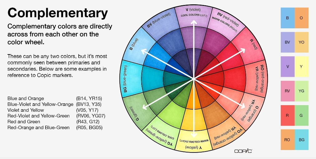
Image source: Copic.Too
Complementary colors (colors directly across from each other on the color wheel) can create a strong visual contrast that makes your products stand out.
Adding this contrast can help you highlight specific features or details about your product.
For example, if your product is a red sofa, and you place it against a green background the colors will contrast and complement each other, creating a focal point in the room.
Apple is a popular brand that uses contrasting colors in its product photos. The premium, black Vision Pro creates a striking contrast with the clean, white background. The result is a sleek, modern design.

Image source: Apple
Other types of colors in color theory include:
- Triadic colors: These colors form a triangle on the color wheel. It brings a unique balance to the color combination. One example is yellow, red, and blue.
- Tonal colors: Tonal colors are shades of the same hue, like rose pink and scarlet red. It creates a soft and subtle look.
- Analogous colors: These colors sit next to each other on the color wheel. They create a sense of cohesion and unity.
- Monochromatic colors: Monochromatic color schemes use different shades of a single color. They create a sense of sophistication and elegance and are common in luxury and high-end advertising.
2. Use Heatmaps
With tools like heat maps, you can gain invaluable insights into how viewers interact with their product images. In fact, you can even identify which colors and compositions attract the most attention and engagement.

Image source: Glassbox
By utilizing a data-oriented method, you can enhance your selection of colors, layout, and overall visual design in order to engage viewers and increase conversions.
In short, heatmaps can empower you to create compelling imagery that resonates with your target audience by:
- Refining product placement
- Fine-tuning color palettes
- Highlighting focal points
Get real-time feedback on what your audience loves. Keep what generates results and eliminate the rest.
3. Utilize Colors to Evoke an Emotional Response
When people see a particular color, it makes them feel an emotion. This phenomenon is called color psychology. Understanding how this works is the key to effective product photography.
For example, people tend to associate red and pink with love. Orange and yellow with joy. Green with contentment and blue with relief.
Getting deeper into color psychology, we can look at how color affects mental and physical health.
Red helps stimulate and increase appetite, while orange improves mood. Green is a calming color, while violet helps with meditation.
So, what does this mean for your product photography?
If you want your target audience to feel a specific way or associate a certain emotion with your product or brand, colors can help you achieve that goal.
For example, if your target audience is yogis, you might incorporate the color violet in your product photos to help your customers feel a sense of calm when viewing your product page.
Hugger Mugger, a brand that sells yoga accessories, is a great example.
Although it has a plain white background and the product itself is violet, this still shows how using a certain color helps e-commerce businesses convey a strong message and appeal to their target audience’s wants and needs.
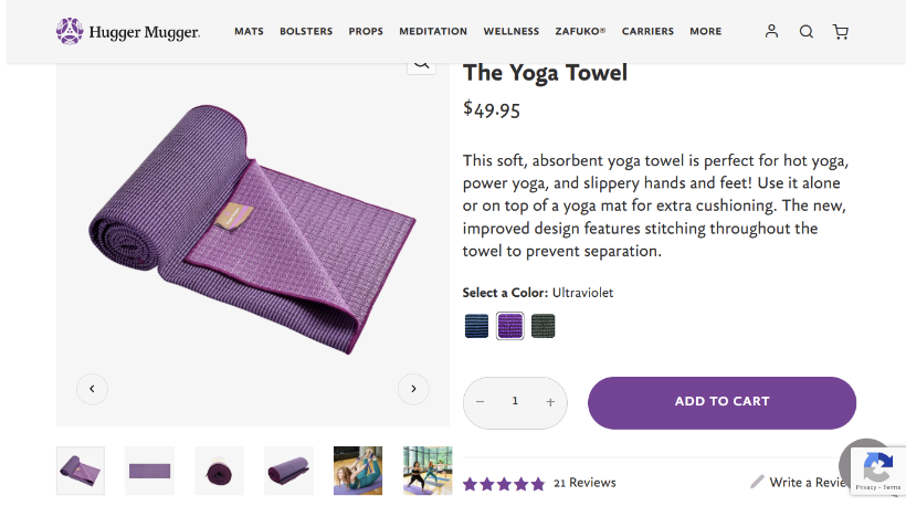 Image source: Hugger Mugger
Hugger Mugger also uses the color violet in its website design.
The call-to-action (CTA) button, review stars, and company logo are all violet, which ties in with the product photography. This helps Hugger Mugger create a consistent online presence.
4. Include Brand-Aligned Colors
When planning the color scheme of your product shoots, be sure to consider the colors of your brand.
Your product photos are part of your branding assets, so being able to maintain consistency across all your visual elements helps strengthen brand recognition and fosters trust with customers.
You should also use backgrounds and props that complement your brand’s color scheme.
Consider using a photo editing software to adjust colors as needed to match your color palette. You might adjust the brightness, saturation, and hue to ensure consistency across all your product images.
Image source: Colorcinch
5. Think Like a Buyer
As you plan the color palette for your product shoots, think about your target audience.
What colors resonate the most with them? If you conducted A/B testing on your product pages in the past, what elements influenced your conversions the most?
Pay attention to the colors in the winning tests and use those in future campaigns and product images, if color was part of your testing.
If you’re targeting a specific niche or industry, consider that, too.
For example, if you’re in the wellness niche, you might incorporate green somewhere in your product photos to convey a sense of health and well-being.
The Honest Company, a brand that offers eco-friendly baby and personal care products, does this throughout its website.
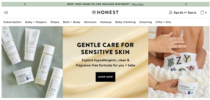
Image source: The Honest Company
This strategic color choice helps reinforce the brand’s commitment to natural ingredients and sustainability.
Thrive Market, an online marketplace for organic and sustainable foods and wellness products, also incorporates green in its product photography.
The color green represents health and vitality, and that’s exactly the message Thrive Market wants to convey to its health-conscious audience.

Image source: Thrive Market
6. Go Bold
Do you have a younger audience? Going brighter with your product photography could be a great idea.
Why? Because Gen Zers prefer vibrant colors. Millennials also like bright and cheerful color palettes.
Skin Starface’s pimple patches are a hit with Gen Z and Millennial customers who want clearer skin. The skincare brand appeals to its younger target audience by using vibrant, eye-popping hues that grab attention.
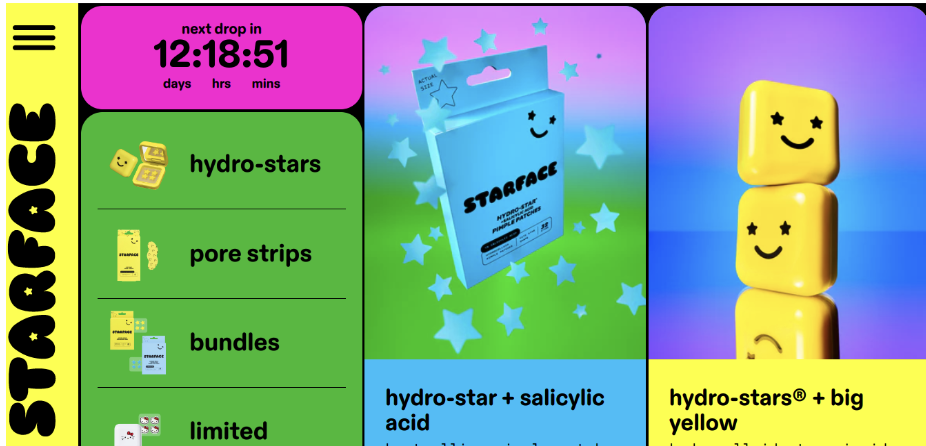
Image source: Starface
7. Choose the Right Background Color
Don’t just choose any background to display your products on.
Ensure that your background is in harmony with your products and enhances their aesthetic appeal.
Choose a background that doesn’t distract from your product, which is the main focus of the photo.
Consider choosing neutral backgrounds like white, gray, or beige. To make your products stand out even more, create contrast. Pair light-colored products with dark backgrounds, and vice versa.
8. Master Color Accuracy
At product shoots, it can be difficult to capture the true color of your products.
And sharing inaccurate depictions of your product can frustrate customers.
Ever ordered something from an e-commerce store, only to be disappointed when it arrived and wasn’t what you expected?
If so, did you lose trust in the brand? Have you ordered from them since? Chances are you haven’t. This is not the experience you want for your customers!
To further highlight the importance of color accuracy in your product images, consider this stat: 22% of people return items because they don’t look how they look in the photo.
So, how do you achieve color accuracy in your e-commerce photography? Here are some tips:
- Use a histogram: Histograms measure the exposure of an image. They do this by showing any color cast or mismatch between the colors you see and the colors you capture. That way, you can adjust the colors as needed to ensure they’re as accurate as possible.
- Pay attention to the light source and be consistent: Different light sources affect how colors appear in your photos. Avoid using different types of lighting (e.g., natural lighting, artificial lighting, etc.). Use a single light source and stick with it for all of your photos.
- Shoot in RAW format: The RAW format gives you more freedom to adjust the white balance during post-processing. For example, if you have underexposed or overexposed areas, you can edit highlights and shadows without losing detail.
- Check color on multiple devices: Having a reliable display screen is a great way to ensure color accuracy. But it’s still important to double-check color tone on different devices to ensure your products appear true to life, no matter what device you use.
- Use color calibration: Color calibration tools can help you measure or adjust how an object’s color responds to its environment. Calibrate your monitor and camera to make sure the colors you see on the screen mirror the color of your products in real life. To do this, adjust brightness, contrast, and color temperature.
Bonus Tip: Manage Your Product Photography Data Effectively
Even though this article is about mastering color harmony in product photography, we couldn’t end it without offering pointers on how to properly manage your product branding assets. This includes filenames, color profiles, and image sizes.
You can do this with an SQL dictionary. You can store, retrieve, and manage your product photography data with ease. As a result, you can maintain consistent product visuals across your website.
Final Thoughts
When dealing with colors in product photos, the possibilities are endless.
You have cool colors. You have warm colors. Then there are bright colors, neutral colors, pastel colors…the list goes on.
Because there are so many possibilities, it can be easy to go wild with your product photography color scheme.
But it’s important to limit your palette to two to four colors.
Also, be intentional with lighting, use contrast, appeal to customers’ emotions, and choose your background wisely to create product photos that pop. Color can make all the difference.
Here’s to your success!
About Guest Author: Britney Steele
Born and raised in Atlanta, Britney is a freelance writer with 5+ years of experience. She has written for a variety of industries, including marketing, technology, business, finance, healthcare, wellness, and fitness. If she’s not spending her time chasing after three little humans and two four-legged friends, you can almost always find her glued to a book or awesome TV series.