
In web design, eye-catching visuals and creative layouts often get much of the attention, setting aside another equally-important element—typography. In fact, typography greatly influences a website’s visual attractiveness and user experience. The fonts you use can either attract and keep readers’ attention or turn them off and send them running.
Typography is an unsung hero with tremendous influence. Typography is more than just selecting fonts; it’s also about setting the tone, communicating ideas, and directing readers.
This in-depth guide delves into the science and art of picking the best fonts for a website’s brand identity and message, including how different typefaces affect readability and user engagement.
The Psychology of Fonts
How fonts influence emotions and perceptions
Font selection significantly influences how people perceive and emotionally connect with content. With over 200,000 fonts available, choosing the right font is daunting. Let’s explore how different fonts evoke specific emotions:
- Serif vs. Sans-serif
Serif fonts (Times New Roman, Garamond, Baskerville) are classic fonts featuring small, decorative strokes extending from letter main strokes. They exude a sense of tradition, elegance, and trustworthiness.
Sans-serif fonts (Arial, Helvetica, Trebuchet MS) are modern, clean, and lack decorative strokes. They convey efficiency and a contemporary feel.
Generally, serif fonts excel in readability, especially in small sizes. In contrast, sans-serif fonts shine for headlines and short text but may lack readability in extended passages.
- Script fonts
Script fonts (e.g., Brush Script, Curlz MT, Vivaldi) are recognizable by their flowing, cursive strokes; they add elegance, luxury, or playfulness. They’re often chosen for branding and marketing materials to establish a distinctive, memorable look.
These fonts can be challenging to read and unsuitable for lengthy text, potentially causing fatigue.
- Display fonts
Display fonts (e.g., Impact, Comic Sans, Jokerman) are for visual impact and attention-grabbing; they work well in headlines, posters, and promotional materials. They instill excitement, urgency, or creativity.
Use display fonts sparingly to prevent overwhelming or distracting your audience, especially in extensive text blocks.
The impact of font size and weight on user perception
Font size and weight play essential roles in shaping user perception and readability:
- Larger fonts enhance readability and are well-suited for headlines and titles.
- Smaller fonts can add elegance and sophistication; you should use these carefully to maintain readability.
- Bold fonts grab attention and are ideal for headlines and important text.
- Thin fonts offer subtlety and are suitable for less critical content.
Color psychology and typography

Image by pressfoto on Freepik
The color of a font significantly influences content perception and emotions. Colors come with associations, making it vital to select them thoughtfully. Here are concise tips on integrating color psychology into typography:
- Appropriate color choice: Choose colors that align with your brand or message.
- Hierarchy through colors: Create a content hierarchy using colors. For instance, employ darker colors for headlines and lighter ones for body text.
- Simplicity is key: Avoid overloading your design with too many colors, which can overwhelm readers.
Readability and User Engagement
The importance of readability in web design
Readability measures how easily readers can understand the text. In web design, this metric is crucial for user-friendly and efficient navigation. A readable website ensures users can quickly access the information they need, enhancing the overall user experience.
Several factors can affect a website’s readability, including the font, font size, line spacing, and color.
Line spacing and its effect on legibility
Line spacing (leading) refers to the space between lines of text. Optimal line spacing is vital for text legibility. Too little can hinder readability, while excessive spacing can scatter text. Aim for 1.5 to 2 times the font size for balanced readability.
Kerning and tracking
Kerning is adjusting the space between individual letters. Tracking is adjusting the space between all letters in a word or line of text.
These adjustments fine-tune text readability. For instance, if letters are too close, kerning can improve readability.
You should also consider between monospaced and proportional fonts. Monospaced fonts have the same width for each character, regardless of the character. Proportional fonts, on the other hand, have different widths for each character.
Enhancing user engagement through typography
Typography is the art and science of arranging type. You can use it to enhance user engagement in several ways.
Hierarchy with font variations
Font hierarchy uses different fonts to create a clear structure for the text on a website. You can use different font sizes, weights, or styles.
Creating compelling calls-to-action with fonts
Calls-to-action prompts are the buttons or links users click to take a desired action. The font used for calls-to-action should be clear, concise, and attention-grabbing.
Aligning Fonts with Brand Identity
 Image by rawpixel.com on Freepik
Consistency is key
Consistency is essential for any brand identity. Use the same fonts, colors, and design elements across your marketing materials, website, and other touchpoints.
When it comes to fonts, consistency is especially important. Fonts can be a powerful way to communicate your brand’s personality and values.
How fonts convey brand personality
Different fonts evoke distinct emotions and associations. When selecting fonts for your brand, consider the personality traits you wish to communicate.
For example, if you want your brand to promote the image of being modern and innovative, choose a sans-serif font.
Choosing fonts that match your brand’s values
Consider your brand’s values when choosing fonts. For a sustainability-focused brand, opt for eco-friendly or clean, minimalist fonts that reflect your commitment to environmental responsibility.
The Art of Font Pairing
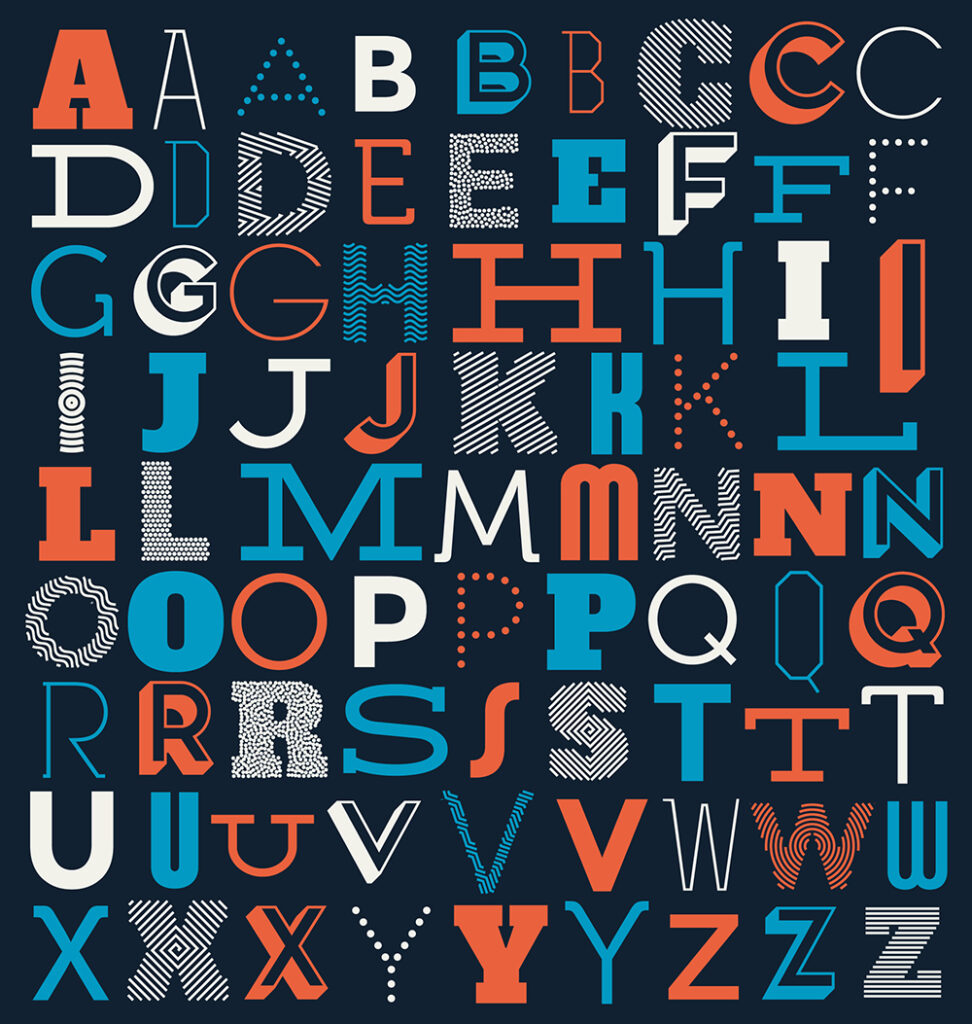 Image by vilmosvarga on Freepik
Combining fonts for harmonious design
When pairing fonts, there are a few key principles to keep in mind:
- Contrast: Contrast is essential for creating a visually appealing design. Use fonts with different weights, styles, or sizes.
- Repetition: Repetition helps to create a sense of unity in a design. Apply the same font or font family throughout your design.
- Hierarchy: Hierarchy helps to guide the eye through your design. Employ different fonts to create a clear structure.
Contrast as a design principle
Contrast is a fundamental design principle that highlights distinctions between elements in a design. In font pairing, contrast creates visually engaging and captivating designs.
There are two main types of contrast:
- Visual contrast: This focuses on the visual disparity between two fonts. For instance, you can pair a bold sans-serif font with a thin-serif font.
- Semantic Contrast: This concerns the difference in meaning conveyed by two fonts. For example, you can match a formal serif font with a casual script font.
When using contrast in font pairing, you must be intentional about the effect you want to create.
Font pairing tools and resources
Several tools and resources are available to help you with font pairing. Here are a few of the most popular:
- Google Fonts: Google Fonts is a free library of over 1,000 fonts you can use in your designs.
- Font Pairer: Font Pairer is a website that helps you to find harmonious font pairings.
- Coolors: Coolors is a color palette generator with a font pairing tool.
Common font pairings for various website types
Here are a few common font pairings that work well for different types of websites:
- Blogs: Sans-serif headlines paired with serif body text.
- E-commerce: Sans-serif headlines matched with sans-serif body text.
- Business Websites: Serif headlines combined with sans-serif body text.
- Creative Websites: Script-style headlines alongside sans-serif body text.
Implementing Typography in Web Design
CSS and web typography
CSS (cascading style sheets) is a language used to control the style of web pages. You can use this to apply typography to your website and control font styles.
Font-family property and font stack
The font-family property specifies the font family for a text. Create font stacks with multiple options; the browser will select the available one.
Controlling font size and weight with CSS
Use the font-size property to determine text size. You should set font-weight to control the boldness of the text. Utilize font style to specify the font style, such as bold or italic.
 Image by creativeart on Freepik
Responsive typography for various devices
Just like using a responsive web design, your typography should be responsive, meaning that it should adapt to different screen sizes. This aspect is important to ensure your typography remains effective and legible on different devices.
There are various ways to make typography responsive, such as using media queries. Media queries allow you to specify different CSS styles for different screen sizes.
Another way is to use a flexbox or grid layout. These layout methods allow you to control how text flows on the page.
Accessibility considerations
It is important to make your typography accessible to users with disabilities. It would be best to use fonts that are easy to read and have good contrast. Of course, you should also use clear and concise language.
Making your typography more accessible can be done in various ways. You can use a sans-serif font. Sans-serif fonts are easier to read for people with dyslexia and other visual impairments.
You can also use a larger font size. This font will make the text easier to read for people with low vision.
Finally, it would help to contrast the text and the background well. This approach will make the text easier to see for people with low vision or color blindness.
Testing and Iteration
Font A/B testing
A/B testing compares two versions of a web page to see which one performs better. Like when you need to know the best times to post on social media, you can use this test to determine which font choices resonate best with your audience.
You would create two versions of your website, each with a different font. You would then show these versions to different users and track which version they prefer.
Gathering user feedback
You can also gather user feedback on typography through satisfaction surveys, interviews, or usability testing.
When gathering user feedback, asking specific questions about the typography is important. For example, ask users which fonts they find the easiest to read or which they think are the most visually appealing.
Holger Sindbaek, who runs a classic gaming platform, Online Solitaire, explains, “We noticed players exiting during tough levels. We suspected our serif font for in-game text was affecting readability. So, we added a feedback button asking, ‘Is the text hard to read?‘ Most said ‘Yes.’ We switched to a cleaner sans-serif font and saw an immediate improvement in player retention and time spent on complex levels. This experience confirmed the power of user feedback in making typography choices that enhance user experience.”
Analytics to refine typography
Analytics can be used to improve your website’s typography continuously. By tracking metrics like bounce rate, time on page, and conversion rate, you can identify improvement areas for your typography.
For example, if users are bouncing from your website after reading a few paragraphs, you may need to make your text easier to read. You could do this using a larger font size or a more readable font.
Learning the Art of Web Typography
In conclusion, typography is an effective method for improving both the aesthetics and usability of a website. You can make sure that your website’s visitors are captivated and engaged from the moment they land on your pages by understanding web-safe and responsive typography and understanding the psychology behind fonts, prioritizing readability and user engagement, aligning fonts with your brand identity, and becoming an expert at font pairing.