Mauve is more than just a shade—it’s a mood, a message, and a timeless design element. With its soft, muted elegance, this unique hue has become a favorite across fashion, branding, home decor, and digital design. But what exactly is mauve? And how can you use it effectively?
This in-depth guide explores the mauve color meaning, its history, psychology, and creative uses—perfect for designers, content creators, and anyone exploring color palettes that strike a balance between subtlety and sophistication.
What Color is Mauve?
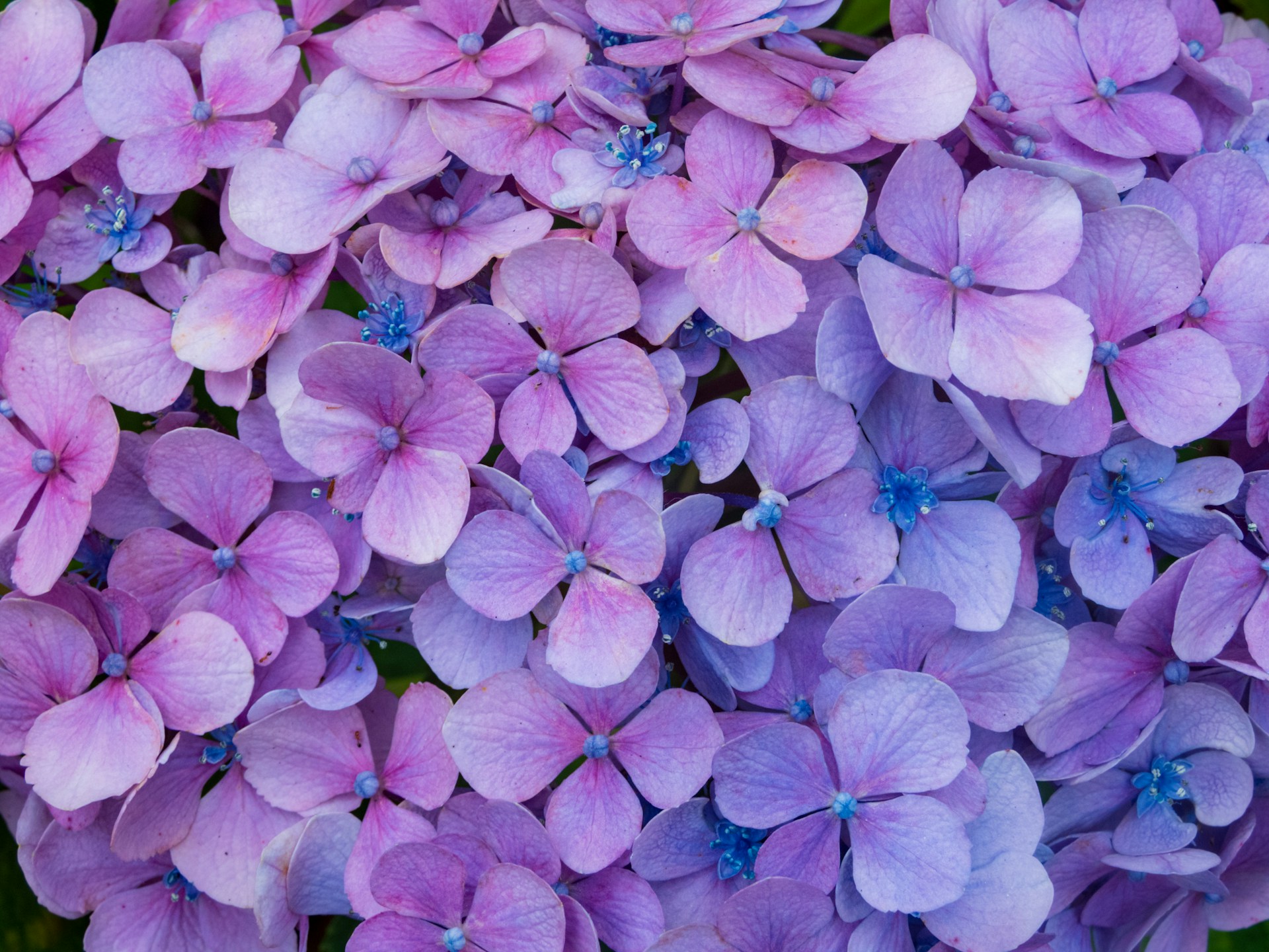
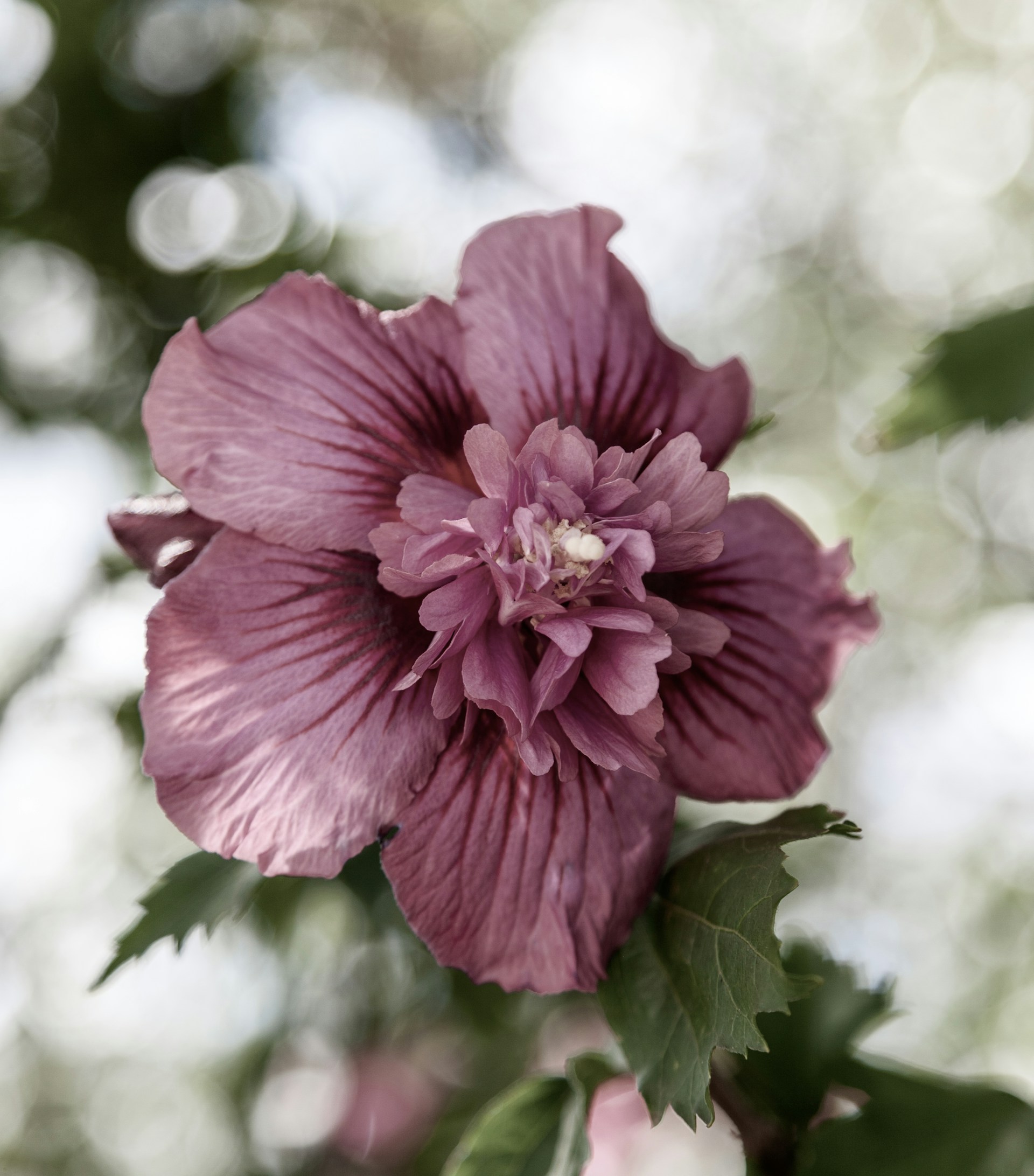
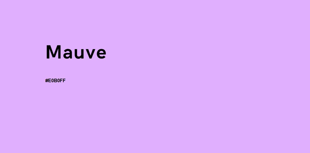
Mauve is a pale purple color with hints of gray, pink, and sometimes blue undertones. It gets its name from the French word malva, referring to the mallow flower.
Mauve Color Code:
- Hex: #E0B0FF
- RGB: 224, 176, 255
- CMYK: 12% Cyan, 31% Magenta, 0% Yellow, 0% Black
Mauve isn’t as vivid as violet or lavender—it’s a dusty, softened purple, making it versatile in both warm and cool palettes.
A Brief History of the Mauve Color
In 1856, 18-year-old chemist William Henry Perkin accidentally discovered mauve while attempting to synthesize quinine for malaria treatment. He named it mauveine, and it became the first synthetic dye ever produced.
Victorian England quickly fell in love with the new shade. Even Queen Victoria famously wore a mauve gown, sparking a fashion frenzy across Europe. Mauve’s invention also kickstarted the modern chemical industry—so its impact goes far beyond aesthetics.
Today, mauve carries that rich legacy, blending scientific discovery with cultural elegance.
Mauve in Color Psychology
In the world of color psychology, mauve stands out for its gentle emotional resonance. A blend of soft purple with gray or pink undertones, mauve evokes a complex range of feelings—balancing tranquility with depth, and romance with introspection.
Emotional and Symbolic Associations of Mauve
Mauve carries a unique emotional weight, often associated with:
- Calmness and serenity – Like lavender, mauve soothes the senses. Its muted tone reduces visual tension, making it ideal for creating peaceful environments.
- Romance and nostalgia – Mauve’s soft, vintage feel stirs up memories and sentimentality. It’s often linked to cherished moments, heartfelt love, and emotional intimacy.
- Youth, femininity, and purity – Historically connected to bridal fashion and mallow flowers, mauve suggests innocence, subtle grace, and timeless beauty.
- Devotion and thoughtfulness – The quiet dignity of mauve conveys emotional intelligence, making it perfect for brands and spaces that prioritize wellness, care, and reflection.
- Creativity and uniqueness – Like other purples, mauve taps into the imaginative side of the brain. Its understated elegance encourages originality and artistic expression.
- Mystery and emotional balance – With its cool undertones, mauve adds a layer of subtle complexity. It doesn’t demand attention but invites deeper engagement.
- Springtime and renewal – Associated with early-blooming flowers, mauve suggests seasonal rebirth and quiet transformation, often used to symbolize hope and fresh beginnings.
- Refinement and luxury – Less bold than royal purple but more distinct than blush, mauve radiates sophistication and understated opulence.
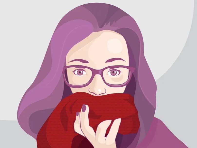
Why Designers Use Mauve to Evoke Emotion
Because of its dusty, dreamy quality, mauve is frequently used in:
- Wellness branding – Yoga studios, mental health apps, and skincare lines lean into mauve to convey safety, care, and emotional well-being.
- Wedding palettes – Mauve offers a romantic, vintage alternative to pink or blush. It pairs beautifully with creams, sage, and soft metallics.
- Art therapy spaces – Mauve encourages introspection and emotional release. Its softness offers visual comfort, making it ideal for creative or therapeutic environments.
- Minimalist branding – Mauve’s muted tone adds visual interest without overwhelming the viewer—great for brands that want calm, trust, and emotional connection.
In essence, mauve is a quiet powerhouse in the psychology of color. It evokes emotion without being dramatic, balances softness with sophistication, and allows both designers and audiences to explore themes of love, thoughtfulness, and renewal. When used with intention, mauve helps craft a visual experience that feels intimate, elegant, and deeply human.
Is Mauve a Warm or Cool Color?
A common question is: “Is mauve warm or cool?”
The answer depends on the undertone:
- Cool mauve leans more bluish-gray.
- Warm mauve contains pink or red undertones.
This dual personality makes mauve highly adaptable—it can function as a neutral, a base, or an accent depending on the context.
Shades of Mauve
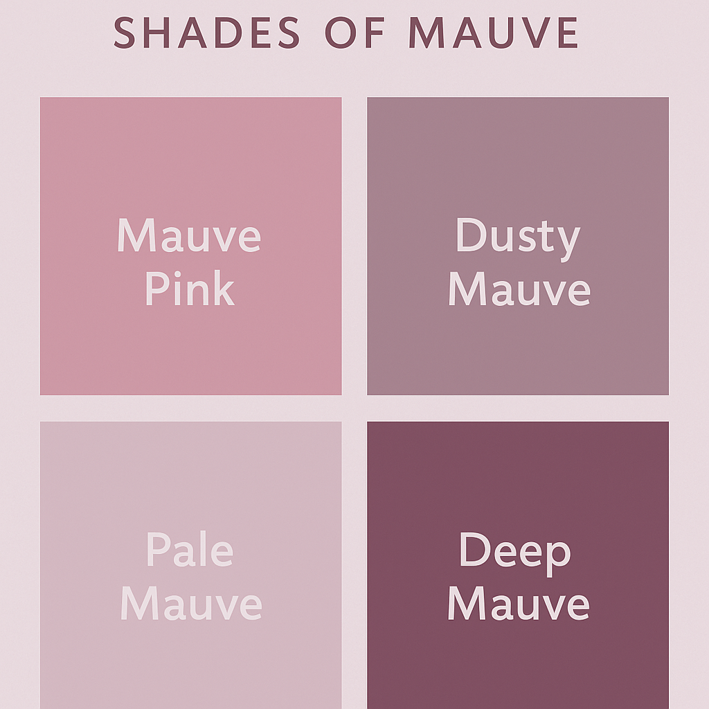
There isn’t just one mauve—there’s an entire spectrum of mauve shades, each offering a unique emotional undertone and visual appeal. From barely-there lilacs to rich, moody purples, mauve adapts beautifully across various design contexts.
Below are some of the most popular mauve variations and how they’re used:
-
Dusty Mauve
A deeper, gray-toned mauve that feels earthy and grounded. Perfect for modern interiors, especially in muted, Scandinavian, or vintage-inspired spaces. It pairs well with sage green, ivory, and terracotta. -
Mauve Pink
A warm, romantic variation with soft pink undertones. Commonly seen in beauty products, wedding themes, and feminine fashion. It evokes tenderness and charm, ideal for brands targeting a youthful or elegant demographic. -
Pale Mauve
A light, pastel version that borders on lavender. It radiates purity and freshness, making it ideal for spring color palettes, children’s designs, wellness products, or minimalist branding. -
Deep Mauve
A richer, more saturated mauve with violet-gray depth. This shade brings a dramatic, luxurious touch to formalwear, branding, or evening-themed visuals. It pairs well with gold, navy, and black for high-contrast elegance.
Each of these mauve shades adds subtle emotional layers to a design:
-
Pale and soft mauves promote innocence, calm, and lightness.
-
Dusty and deep mauves introduce sophistication, mystery, or quiet strength.
-
Warmer mauves like mauve pink infuse sentimentality and femininity into branding or styling.
By understanding the nuances within the mauve spectrum, designers can select the exact tone that aligns with the message, mood, or target audience of a project—whether it’s a branding palette, fashion line, or digital interface.
To find the perfect shade, try using the Colorcinch Color Picker—a helpful tool for exploring mauve tones and building cohesive palettes with ease.
Mauve in Interior Design
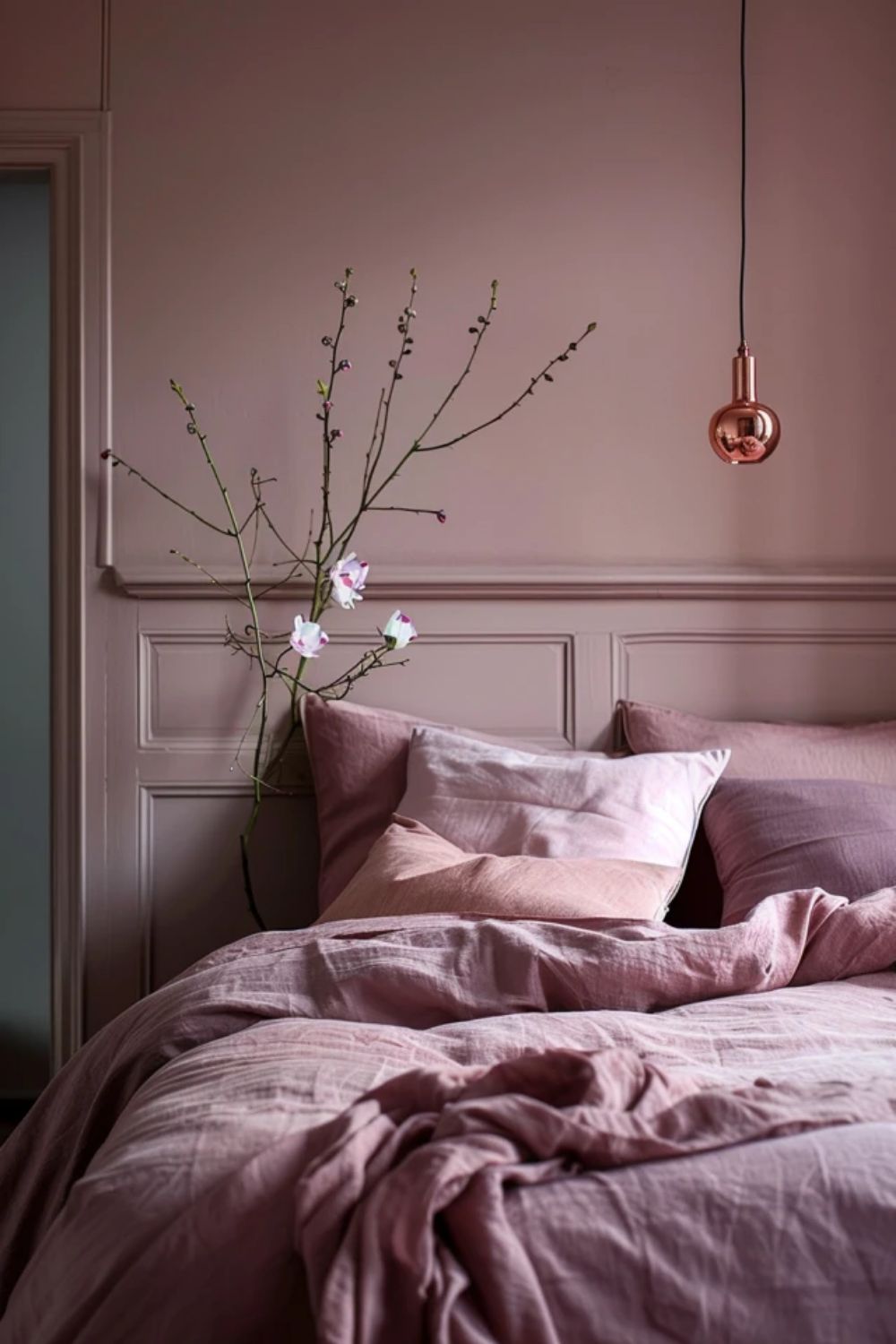
Mauve has quietly emerged as a modern interior design favorite. Its muted elegance makes it ideal for:
- Wall paint in bedrooms, nurseries, or living rooms
- Textiles like velvet cushions, curtains, and throws
- Decor accents, including ceramics and dried floral arrangements
Best Color Pairings with Mauve in Interiors:
- Mauve + Sage Green – Natural and calming
- Mauve + Cream or Off-White – Airy and romantic
- Mauve + Navy Blue – High contrast, luxurious
- Mauve + Terracotta – Earthy and warm
Using these palettes gives depth while maintaining a serene atmosphere.
Mauve in Graphic and Web Design
If you’re building a website or branding a product, mauve offers a clean, modern vibe that appeals to millennials and Gen Z.
Where It Works Best:
- Wellness & Self-Care Brands
- Boutique Clothing Labels
- Skincare & Beauty Packaging
- Therapy or Coaching Websites
Its associations with comfort, self-expression, and creativity make it a go-to for brands that prioritize emotional connection and trust.
Pro Tip: Use mauve as a primary color in branding or a background shade in web UI. It’s soft on the eyes and excellent for readability when paired with charcoal or navy text.
Mauve in Fashion
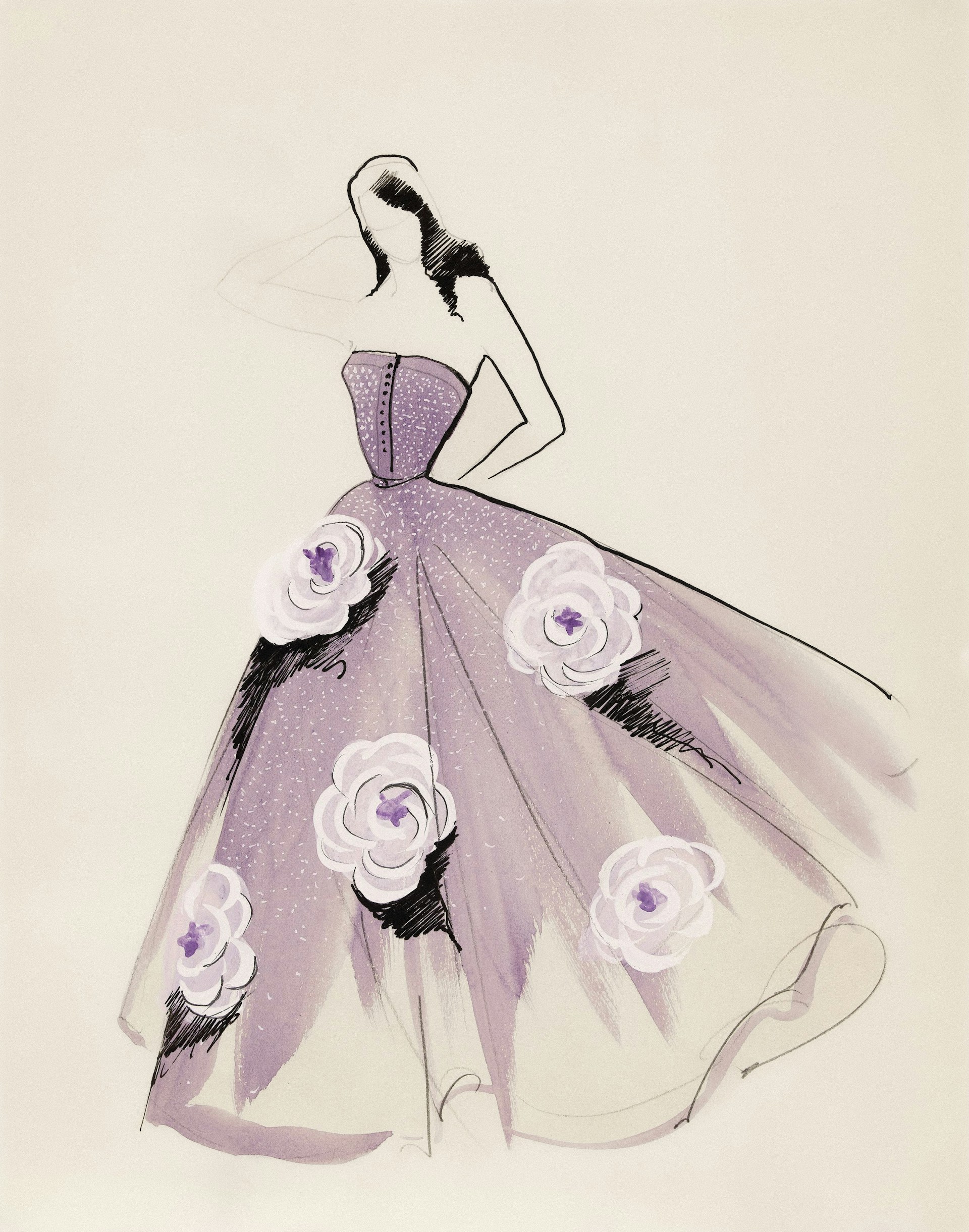
From bridal gowns to streetwear, mauve makes a subtle yet stylish statement.
Why Designers Love It:
- Flatters every skin tone
- Pairs well with neutrals and metallics
- Seasonless—works in both summer and winter fashion
Searches for “mauve bridesmaid dresses”, “mauve wedding themes”, and “mauve nail color” continue to trend globally, proving its relevance in both casual and formal wear.
Using Mauve in Branding and Marketing
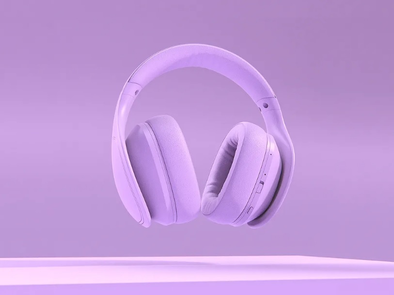
Mauve delivers a message of gentle elegance and modern femininity. It’s perfect for brands that want to evoke:
- Soft confidence
- Luxury without flashiness
- Trust and emotional warmth
Brand Color Combinations:
- Mauve + Gold – Premium and graceful
- Mauve + Olive Green – Earthy and sustainable
- Mauve + Dusty Blue – Serene and creative
It’s often featured in handcrafted product labels, clean skincare packaging, and Instagram aesthetics that lean into vintage, boho, or cottagecore vibes.
Mauve in Art and Photography
Mauve is often chosen by artists and photographers for its emotional nuance. It creates a subtle contrast and evokes a soft, introspective atmosphere in:
- Portrait backgrounds
- Still life compositions
- Abstract designs
- Wedding photography and floral styling
For photographers, using mauve props or lighting can add a romantic vintage tone that’s universally appealing.
Accessibility Tip: Is Mauve Color Blind Friendly?
While mauve is generally distinguishable to most people, it can appear similar to gray or taupe for some individuals with red-green color blindness. For best accessibility:
- Use high-contrast text over mauve backgrounds
- Pair it with bold accent colors like navy, black, or white
- Test your palette with online tools like Coblis (Color Blindness Simulator)
Final Thoughts: Why Mauve Matters
Mauve is more than just a color—it’s a feeling, a story, and a design choice that speaks softly but leaves an impression. With its gentle elegance, emotional range, and surprising versatility, mauve continues to inspire artists, designers, and brands around the world.
Whether you’re choosing a color for your brand, designing your next home interior, or curating your social media aesthetic, mauve offers a perfect blend of nostalgia, creativity, and calm.
Love Soft, Emotional Colors?
Explore our full Muted Colors Filter and Ivory Color Guide for curated palettes, mood boards, and creative design ideas featuring timeless, understated hues that bring calm and character to any project.


