
When it comes to creating timeless and elegant visuals, ivory color is a favorite among designers and photographers alike. Softer than pure white and warmer than cream, ivory brings depth, refinement, and calm to any project.
But what exactly is ivory color, and how can you use it effectively in your creative work? Whether you’re building a brand, styling a photoshoot, or designing a website, this guide will walk you through what ivory color is, its hex code, meaning, and how to use it in both graphic design and photography.
What Is Ivory Color?
Ivory is a pale off-white shade with subtle warm undertones. It gets its name from natural ivory (like elephant tusks), which has a soft, creamy hue. In design and photography, ivory color is prized for its versatility and warmth—it sits beautifully between white and beige on the color spectrum.
-
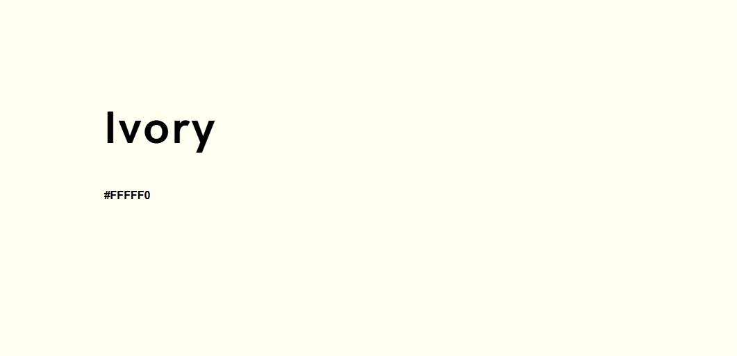
Hex Code: #FFFFF0
-
RGB: (255, 255, 240)
-
CMYK: 0%, 0%, 6%, 0%
If you’re working in digital media and need to find ivory color in RGB or hex format, the code above is your go-to reference. Its warm white appearance makes it perfect for background use or as a base in color palettes.
Ivory Color Meaning and Symbolism
Colors are powerful communication tools, and ivory is no exception. The meaning of ivory color is often associated with calmness, elegance, and timelessness. While white is linked to purity and simplicity, ivory adds a layer of warmth and maturity.
In branding and design psychology, ivory represents:
-
Quiet luxury
-
Soft sophistication
-
Peace and harmony
This makes it a strong choice for wellness brands, wedding creatives, and minimalist layouts that aim to feel elevated without being flashy.
Ivory vs. White vs. Cream
Let’s clear up a common confusion: what’s the difference between ivory, cream, and white? Here’s how they compare:
-
White (#FFFFFF) has no undertone, offering a pure, clean base. Its overall feel is crisp, modern, and minimal—perfect for creating a fresh and airy aesthetic.
-
Ivory (#FFFFF0) carries a soft yellow or beige undertone, giving it a warm, elegant touch. It evokes a classic and timeless feel, often used in refined or traditional designs.
-
Cream (#FFFDD0) leans into a richer yellow undertone, resulting in a cozy and vintage vibe. This shade feels inviting and warm, making it ideal for soft, nostalgic palettes.


So if you’re deciding between ivory vs cream color for a brand or background, ask yourself: do you want soft elegance (ivory) or rich warmth (cream)? Ivory works especially well when white feels too stark but cream feels too golden.
How to Use Ivory in Photography
Whether you’re shooting portraits or editing product flat lays, using ivory in photography can make a world of difference. Here are three practical ways to incorporate this color into your creative workflow.
1. Ivory as a Background Color
Ivory makes an ideal background color for photography. It softens light, reduces glare, and adds depth without stealing attention. Unlike white, which can sometimes overexpose highlights, ivory helps maintain detail and gives your image a natural warmth.
Use it in:
-
Lifestyle flat lays
-
Portrait shoots with natural light
-
Product photography for skincare, clothing, and home goods
2. Ivory in Wardrobe and Styling
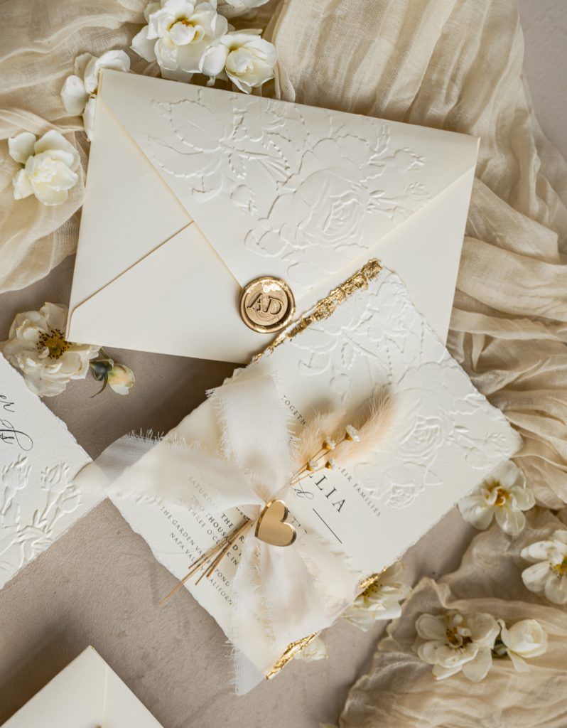
In fashion photography, ivory clothing is a game-changer. It photographs beautifully, complements most skin tones, and pairs easily with neutrals, jewel tones, and earthy hues. Whether it’s an ivory dress, sweater, or suit, this color adds quiet luxury to your visuals.
3. Post-Processing with an Ivory Look
Want to add an ivory tint during photo editing? Slightly reduce blue highlights and warm up your whites using editing tools like Colorcinch. This technique works especially well in wedding photography, where it can soften gowns, florals, and overall lighting for that dreamy, editorial vibe.
Using Ivory Color in Graphic and Web Design
Ivory is more than just a beautiful backdrop—it can anchor entire design systems. Here’s how to use ivory in design effectively:
Minimalist Layouts
Ivory is a go-to in minimalist design. It brings in softness without compromising cleanliness. You can use ivory as a website background color, header section, or page divider. It’s also perfect for blogs, lifestyle portfolios, and elegant business sites.
Accessible and Readable
While ivory adds subtlety, it also improves visual comfort. On screens, it prevents eye fatigue that often comes with bright whites. Just make sure your text contrast is strong enough—use charcoal, navy, or forest green for readability.
Branding and Packaging
In branding, ivory is used by luxury and organic brands to signal trust and quality. Whether it’s a logo background or product packaging design, ivory gives a handcrafted, premium feel.
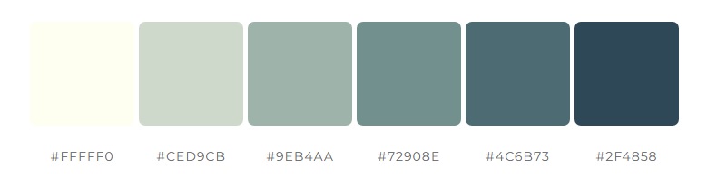
Ivory Color Combinations That Work
Ivory doesn’t just play well with others—it elevates them. If you’re creating a color palette with ivory, consider pairing it with tones that enhance its softness or provide contrast.
Popular Ivory Color Combinations:
-
Ivory and sage green: For natural, calming designs
-
Ivory and navy blue: For contrast with elegance
-
Ivory and blush pink: For romantic, feminine aesthetics
-
Ivory and gold: For upscale, celebratory visuals
-
Ivory and charcoal gray: For professional, minimalist vibes
-
Ivory and yellow: For a warm, sunny palette that feels cheerful and fresh
-
Ivory and lavender or violet: For balance using yellow and its opposite, adding both softness and visual interest
These combinations are frequently seen in wedding stationery, lifestyle branding, and product packaging because of their timeless appeal.
Ivory in Web and Mobile Design
Designers often wonder: can I use ivory on websites and mobile apps? Absolutely. Just keep a few usability tips and core principles of design in mind—like contrast, balance, and hierarchy.
-
Make sure the text stands out—avoid pale font colors on ivory backgrounds.
-
Ivory works best in sections (hero areas, footers, image overlays), not necessarily as a full background unless contrast is maintained.
-
Test your design across devices—ivory may look whiter on some screens.
With the right balance, ivory website backgrounds can give your project a clean yet inviting feel.
Ivory Variations and Related Shades
Looking to build a broader palette? Here are ivory-inspired tones you can explore:
-
Classic Ivory (#FFFFF0): The standard ivory tone with a soft, neutral feel.
-
Antique White (#FAEBD7): A vintage-inspired shade that’s slightly deeper and warmer than classic ivory.
-
Linen (#FAF0E6): A soft hue with subtle pinkish undertones, adding a gentle, romantic touch.
-
Light Beige (#F5F5DC): Earthier and slightly cooler, ideal for a more grounded, natural look.
-
Cream (#FFFDD0): Warmer and more yellow than ivory, evoking a cozy and inviting atmosphere.
These options are great for building a warm neutral color palette or for adjusting based on lighting or brand identity.

Is Ivory a Neutral or a Trend?
Some colors fade in and out of popularity, but ivory remains a timeless neutral. It adapts beautifully across industries—whether you’re designing for fashion, home interiors, tech, or editorial platforms.
While ivory may not trend on its own like millennial pink or digital lavender, it often serves as the quiet foundation behind many of today’s trend-forward designs.
So if you’re wondering, is ivory outdated in design?—the answer is a confident no. In fact, it’s a designer’s secret weapon.
Final Thoughts
Ivory may not grab attention at first glance, but its charm lies in its restraint. In both photography and design, ivory color adds a sense of calm, luxury, and balance. It flatters subjects, softens scenes, and enhances everything around it.
Whether you’re choosing a neutral background for your website, building a brand identity, or styling a photoshoot, ivory is a safe yet sophisticated choice. It doesn’t just support the main act—it elevates it. If you’re unsure which ivory shade works best for your project, try using the Colorcinch color picker. It helps you explore subtle variations of ivory and match them seamlessly with other tones in your palette—perfect for creating cohesive and elegant visuals.
Frequently Asked Questions
What is ivory color used for in design?
Ivory is ideal for background colors, branding, packaging, and minimalist layouts thanks to its warmth and elegance.
Can I use ivory as a website background color?
Yes, as long as your text contrasts well with it. Ivory is more comfortable on the eyes than white and adds a soft, professional feel.
Is ivory a neutral color?
Yes, ivory is considered a warm neutral, making it highly versatile in both digital and print design.
How does ivory compare to cream and white?
Ivory is softer and warmer than white, but less yellow and rich than cream, offering the perfect in-between.
What colors pair best with ivory?
Ivory works beautifully with sage green, navy, blush pink, gold, and charcoal for both elegant and contemporary designs.