
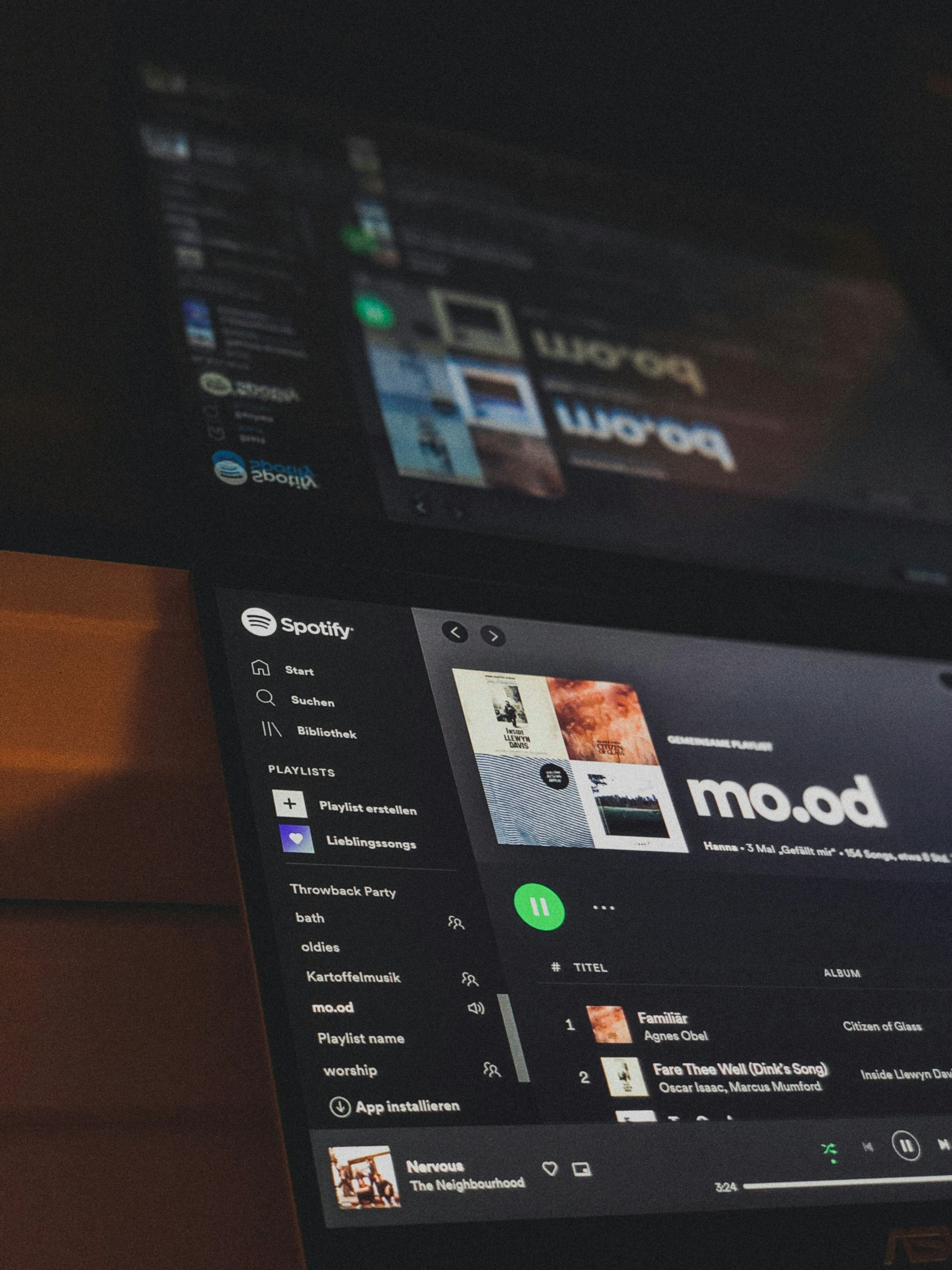
Whether you’re curating moody jazz for rainy days or throwing together your gym hype playlist, one thing’s for sure—your Spotify playlist cover matters more than you think. In the age of visual storytelling, the tiny square next to your playlist name can make the difference between someone clicking or scrolling right past.
If you’ve ever tried uploading a cover and wondered, “Why does it look pixelated?” or “What’s the best size for Spotify playlist covers?”, you’re in the right place. As a photographer and visual design enthusiast, I’m here to help you nail that crisp, professional look—starting with one golden rule: 300×300 pixels is the sweet spot for Spotify playlist covers.
Let’s dive into why that size matters, how to make your covers look stunning, and how to create aesthetic Spotify playlist covers without needing a graphic design degree.
Why 300×300 Pixels Is the Standard for Spotify Playlist Covers
Let’s start with the technical stuff—Spotify recommends a square image with a minimum of 300×300 pixels for playlist artwork. That means your image should have equal height and width, and ideally be in JPEG or PNG format.
But here’s the nuance: while 300×300 px is the minimum, Spotify actually allows higher resolutions (up to 4,000×4,000 px). So why stick with 300×300?
-
Fast Load Time: Smaller files load quicker across devices. That matters when you’re sharing your playlist link and want the cover to appear instantly.
-
Sufficient Quality: On a mobile screen, a 300×300 image looks crisp and clean. If you’re not zooming in or printing it, it’s more than enough.
-
Effortless Uploading: Larger images might require resizing or compressing, while 300×300 uploads instantly without hiccups.
So if you’re just looking to make your playlist stand out without getting caught up in advanced editing, sticking to 300×300 is a safe and smart move.
What Makes a Good Spotify Playlist Cover?
Let’s get honest—most of us judge a playlist by its cover before ever listening. It’s visual shorthand for the mood, genre, or vibe. A good playlist cover does three things:
-
Captures the mood or theme of your playlist
-
Looks clean and aesthetic at a small size
-
Stands out among others when scrolling
That last point is key. When someone’s browsing their Spotify home feed or shared playlists, your cover only appears in a tiny square. That means contrast, bold typography, and simplicity go a long way.
Design Tips for 300×300 Playlist Covers
You don’t need fancy tools or a photographer’s eye to make a solid Spotify cover. But there are a few things worth keeping in mind:
1. Stick to a Visual Theme
Your cover should match the mood of your playlist. Think of it like album art.
-
For lo-fi beats: muted colors, grainy textures, retro fonts
-
For a summer playlist: bright tones, beach scenes, sun flares
-
For workout jams: bold fonts, high contrast, energetic motion
You can browse design inspiration on sites like Pinterest or Behance by searching terms like “aesthetic Spotify playlist covers” or “moodboard for playlist design.”
2. Use Readable Typography (Or None at All)
If you’re adding text to your cover, make sure it’s readable. Sans-serif fonts tend to perform well at small sizes. That said, many people skip text altogether and use imagery to speak for itself—which can actually be more striking.
Pro tip: If you do use text, try to center it and use high contrast. White on dark background, black on light—classic combos for a reason.
3. Avoid Clutter
300×300 pixels doesn’t give you a ton of real estate. Overly detailed graphics will look messy when shrunk. Instead, opt for:
-
Simple shapes
-
Strong color blocking
-
Centralized elements
A minimalist design isn’t just trendy—it’s practical for the format.

Where to Find Aesthetic 300×300 Pictures for Spotify
If you’re not a photographer or designer, no worries. You don’t have to start from scratch. Here are a few resources you can tap:
Free Stock Photo Sites
-
Pexels and Unsplash offer high-quality images that you can crop into square format. Search by emotion or keyword: “melancholy”, “sunset”, “cityscape”, etc.
Just remember to double-check licensing if you plan to share your playlist widely.
Online Editors (Pre-Sized for Spotify)
-
Canva – Search for “Spotify playlist cover” to find editable templates already set to 300×300 px.
-
Fotor and Snappa – Both have drag-and-drop design tools with text, overlays, and built-in stock photos.
- Colorcinch -an intuitive photo editor with built-in filters, text tools, and aesthetic effects—perfect for quick, polished designs.
These tools are great for adding titles, filters, and even grain effects for that dreamy aesthetic.
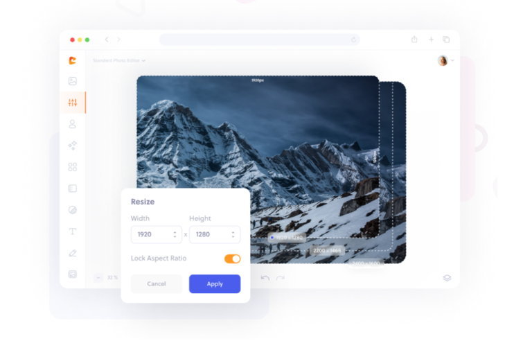
Customizing Your Own 300×300 Spotify Cover
Want to personalize your playlist cover with photography or custom graphics? Here’s a quick workflow:
Step 1: Start with a Square Canvas
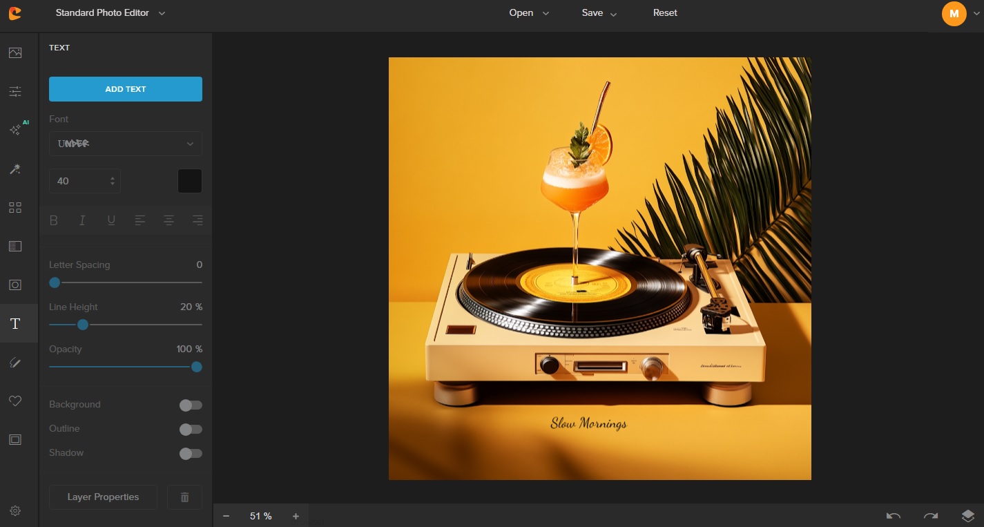
Hop on to Colorcinch and set your canvas to 300×300 px. You can always upscale later, but it helps to design for the actual size you’ll be uploading.
Step 2: Import Your Image or Take One
If you’re a photographer, this is your moment. Take a photo that represents the playlist mood—a foggy landscape, colorful vinyl records, a cup of coffee on a windowsill. Subtle storytelling makes your playlist more engaging.
Step 3: Add Enhancements
Overlay text, tweak contrast, add grain or a soft blur. You can even layer textures like paper creases or light leaks.
Tip: When in doubt, less is more. One powerful image with a color filter often beats a busy collage.
Common Mistakes to Avoid
Even seasoned designers run into a few hiccups. Here are mistakes we see all too often when creating 300×300 pictures for Spotify:
-
Wrong dimensions: Uploading a rectangular photo will crop weirdly or stretch, especially on mobile.
-
Too much detail: Tiny text and intricate visuals don’t translate well at this scale.
-
Low-quality images: Blurry or pixelated photos hurt the professional vibe you’re aiming for.
-
Ignoring mood: Your playlist says “chill acoustic”, but the cover is bright neon. That’s a disconnect.
Take the time to match your visual to your music. It’s a small effort with big payoff.
Why Visual Branding Matters—Even for Personal Playlists
You might be thinking, “This is just for fun—why put effort into a playlist cover?” But hear me out.
Whether you’re an aspiring musician, a brand sharing curated tunes, or just a playlist aficionado, consistent and intentional visuals build trust and identity. That tiny 300×300 image acts as a visual anchor—when done well, it signals care and creativity.
If someone shares your playlist on social media, or includes it in a blog, your cover shows up as the thumbnail. It’s free branding, essentially.

Real Examples of Great Spotify Playlist Covers
Here’s a bit of inspiration. These covers nail the aesthetic and stay functional:
-
“Sad Indie” – A washed-out photo of a girl looking out the window, soft lighting, and muted gray tones. No text, but the mood is crystal clear.
-
“Coffeehouse Vibes” – Simple top-down shot of latte art on a wooden table. Warm hues, subtle grain.
-
“Hype Gym Mix” – Bold red background with the word “ENERGY” in block caps. High contrast, no image needed.
Notice the simplicity? You don’t need to over-design. You just need clarity and mood.

Final Thoughts: 300×300 Playlist Covers Can Be Tiny Works of Art
It’s easy to overlook a square image on your music app. But those little 300×300 pictures for Spotify carry weight—they represent your sound, your taste, your identity.
And in the world of photography and design, that’s a canvas worth taking seriously.
Whether you use a tool like Colorcinch, crop your own original photo, or find a beautiful free stock image, just remember this: the best playlist covers are not just visually pleasing—they’re emotionally resonant.
Quick Checklist for Perfect Playlist Covers
- Image size: 300×300 px minimum, square format
- File type: JPEG or PNG
- Design: Clear, uncluttered, on-theme
- Fonts: Bold and readable, or none at all
- Mood: Make sure the visual reflects the playlist vibe
When in doubt, open your favorite playlist and ask, “Does this image feel like the music?” If yes, you nailed it!